修改创建的可视化对象
添加颜色以及对图形大小的调整
- 颜色:
可视化对象由绘图函数进行创建,图像的颜色可以用 ‘color’关键字给定。如果用此方法,它将会把颜色无差别地匹配图像的所有内容。译者注:这里绘图函数指的是.mlab方法创建,管线搭建方法是类似的。
如果您想根据您的可视化结果让可视化的图形颜色不同,您需要将scalar标量数据传入赋给每一个数据点。默认情况下,绘制矢量图时候,它用矢量信息的范数来作为标量值的大小;对于另外一些情况是采用的z值作为其标量值。 译者注:如quiver3d绘制的矢量箭头颜色的深浅是由所给数据uvw进行欧氏距离计算得到的。对于非矢量绘图的数据,采用的是传入的z值,也就是高度信息作为颜色深浅。
将标量信息转化成颜色会用到下面的配色表,也叫LUT-——Look Up Table。以下列举配色方案:
accent       flag          hot      pubu     set2
autumn       gist_earth    hsv      pubugn   set3
black-white  gist_gray     jet      puor     spectral
blue-red     gist_heat     oranges  purd     spring
blues        gist_ncar     orrd     purples  summer
bone         gist_rainbow  paired   rdbu     winter
brbg         gist_stern    pastel1  rdgy     ylgnbu
bugn         gist_yarg     pastel2  rdpu     ylgn
bupu         gnbu          pink     rdylbu   ylorbr
cool         gray          piyg     rdylgn   ylorrd
copper       greens        prgn     reds
dark2        greys         prism    set1
选择配色表最简单的方法是使用GUI图形界面(这将会在下一段进行介绍)。设置颜色的选项在 `Colors and legends`节点里面。
如果使用自定义的配色方案,您需要自行编写代码,详细请参考`example_custom_colormap`。
- 图形的大小:
The scalar information can also be displayed in many different ways. For instance it can be used to adjust the size of glyphs positioned at the data points.
A caveat: Clamping: relative or absolute scaling Given six points positioned on a line with interpoint spacing 1:
x = [1, 2, 3, 4, 5, 6]
y = [0, 0, 0, 0, 0, 0]
z = y
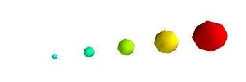
如果我们将数据的标量范围设定为0.5到1:
s = [.5, .6, .7, .8, .9, 1]
使用`points3d`方法,我们将数据集可视化成球状,标量数据会和数据集进行一一匹配。
from mayavi import mlab
pts = mlab.points3d(x, y, z, s)
默认情况下,小球的直径不是严格的。事实上,标量最小的值它的直径是空值null,最大的值所对应的球,其直径正比于点与点之间的距离。这个比例是相对的,如下面的结果:
This behavior gives visible points for all datasets, but may not be desired if the scalar represents the size of the glyphs in the same unit as the positions specified.
这时候您可以通过指定scale_factor控制放缩系数,从而关闭auto-scaling自动放缩。
pts = mlab.points3d(x, y, z, s, scale_factor=1)
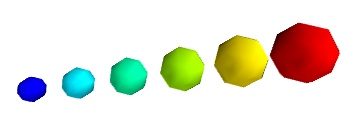
警告
在Mayavi的早期版本(包括3.1.0之前),图形的放缩并不是自动的。由于可视化的图形尺寸偏小,导致可视化看起来很空旷。而数据中的最小值其图形直径是严格为0的,除非您指定,其导致图形无法放缩。
pts.glyph.glyph.clamping = False
- 标量和矢量可视化的更多表现:
There are many more ways to represent the scalar or vector information attached to the data. For instance, scalar data can be ‘warped’ into a displacement, e.g. using a WarpScalar filter, or the norm of scalar data can be extracted to a scalar component that can be visualized using iso-surfaces with the ExtractVectorNorm filter.
- Displaying more than one quantity:
You may want to display color related to one scalar quantity while using a second for the iso-contours, or the elevation. This is possible but requires a bit of work: see Atomic orbital example.
If you simply want to display points with a size given by one quantity, and a color by a second, you can use a simple trick: add the size information using the norm of vectors, add the color information using scalars, create a
quiver3d()plot choosing the glyphs to symmetric glyphs, and use scalars to represent the color:x, y, z, s, c = np.random.random((5, 10)) pts = mlab.quiver3d(x, y, z, s, s, s, scalars=c, mode='sphere') pts.glyph.color_mode = 'color_by_scalar' # Finally, center the glyphs on the data point pts.glyph.glyph_source.glyph_source.center = [0, 0, 0]
Changing the scale and position of objects
Each mlab function takes an extent keyword argument, that allows to set its (x, y, z) extents. This give both control on the scaling in the different directions and the displacement of the center. Beware that when you are using this functionality, it can be useful to pass the same extents to other modules visualizing the same data. If you don’t, they will not share the same displacement and scale.
The surf(), contour_surf(), and barchart() functions, which
display 2D arrays by converting the values in height, also take a
warp_scale parameter, to control the vertical scaling.
Changing object properties interactively
Mayavi, and thus mlab, allows you to interactively modify your visualization.
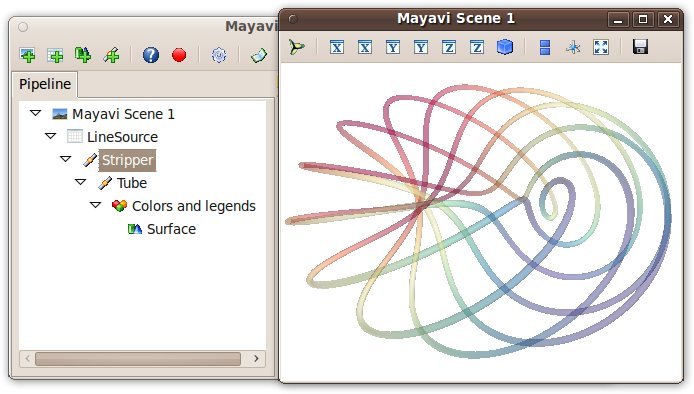
The Mayavi pipeline tree can be displayed by clicking on the mayavi icon
in the figure’s toolbar, or by using show_pipeline() mlab command.
One can now change the visualization using this dialog by double-clicking
on each object to edit its properties, as described in other parts of
this manual, or add new modules or filters by using this icons on the
pipeline, or through the right-click menus on the objects in the
pipeline.
除此之外,每一个生成的对象都会有返回值,它将返回mlab函数。``this_object.edit_traits()``将启动一个对话框,您可以用交互的方式对对象的属性进行编辑。如果您没能成功开启对话框,请参考`running-mlab-scripts`。