mlab:用Python脚本进行3D绘图
我们简称`mayavi.mlab`模块为mlab,就像我们在 matplotlib 中寥寥几行代码的 pylab 一样,mayavi2提供了一种简单的方式进行数据可视化。用户可以在Mayavi强大的性能下快速3D可视化。
在设计层面,Mayavi的mlab模块是很适合脚本语言的。并且它不完全是一个面向对象的API,它可以和IPython进行交互。
警告
接下来的例子将演示,在Ipython中使用mlab的情形。 IPython需要使用——“$ ipython –gui=qt”命令行选项来调用,如下所示:
$ ipython --gui=qt
最新版本的IPython我们也可以用这种方式:
In []: %gui qt
如果提示异常信息:
ValueError: API 'QString' has already been set to version 1
这是由于PyQt和PySide不兼容造成的。解决方法是运行:QT_API=pyqt ETS_TOOLKIT=qt4 ipython。更多的内容请参考`ipython documentation page` 页面。
如果一些其他原因导致Mayavi的Qt后端错误,您也可以通过以下方式使用wxPython后端: $ ETS_TOOLKIT=wx $ ipython –gui=wx
$ ETS_TOOLKIT=wx
$ ipython --gui=wx
关于mlab的更多细节,请参考`Running mlab scripts`章节。
这一节,我们仅介绍 mlab 简单的绘图函数,以numpy数组的方式创建3D对象。现在我们要介绍: (1).如何修改颜色和字体大小 (2).如何使用`mlab`进行可视化以及通过可交互的图形界面进行修改 (3).如何书写脚本以及运行动画 最后,我们将展示”mlab”的高级用法,它将以完整的pipeline管线方式进行脚本搭建。在这里我们将给出一些具体的案例,对标量数据和矢量数据进行可视化。
一个案例
我们将以球谐函数的面绘制作为一个案例开始:
# Create the data.
from numpy import pi, sin, cos, mgrid
dphi, dtheta = pi/250.0, pi/250.0
[phi,theta] = mgrid[0:pi+dphi*1.5:dphi,0:2*pi+dtheta*1.5:dtheta]
m0 = 4; m1 = 3; m2 = 2; m3 = 3; m4 = 6; m5 = 2; m6 = 6; m7 = 4;
r = sin(m0*phi)**m1 + cos(m2*phi)**m3 + sin(m4*theta)**m5 + cos(m6*theta)**m7
x = r*sin(phi)*cos(theta)
y = r*cos(phi)
z = r*sin(phi)*sin(theta)

# View it.
from mayavi import mlab
s = mlab.mesh(x, y, z)
mlab.show()
以上案例的代码是为了创建数据,一行代码就足以对它进行可视化。其可视化的图像如下所示:
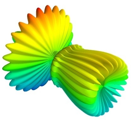
可视化由一个函数完成:mesh
这类案例mlab都有所提供(详见:test_contour3d, test_points3d, test_plot3d_anim 等)。上面演示的`test_mesh`。在IPyhon中可以通过在`mlab.test`用tab键的自动补全找到。您也可以在IPython中通过手动输入`mlab.test_contour3d??`查看代码。
关于numpy数组的3D可视化
通过`mlab`的一系列函数,可以对numpy进行数据可视化。
mlab`函数将numpy数组作为输入,描述数据的``x`, y, z 坐标,并以此构建成熟的可视化:如果有需要,它们可以完成data source数据源层级、filter滤波层级以及visualization module可视化模块层级的创建。与matplotlib的pylab类似,它们的创建过程可以通过关键字参数进行调整。此外,它们都可以返回所创建的可视化模块对应的对象,因此可以通过修改它们的属性对可视化进行修改。
备注
这一节,我们仅列出不同的函数。对于每一个函数的具体用法请参考`mlab-reference`,在这份指南的最后,我们将附上图像和案例。
0D数据 和 1D数据
points3d 方法 |
points3d`方法
它将显示数据所给位置的图形(如点状,可以是其他形状),其位置信息由numpy数组给定,坐标由``x`, |
plot3d 方法 |
plot3d`方法将绘制线,数据``x`, |
2D数据
imshow方法 |
imshow 可以将2D数组可视化成一张图像。 |
surf 方法 |
surf方法将2D数组平铺成一张毯子,并用z坐标表示高度。 |
contour_surf 方法 |
`contour_surf`将使用2D数组绘制等高线,并用一个坐标表示等高线的高度。 |
mesh 方法 |
mesh`方法用于绘制面绘制,由3个2D数组给定, ``x`, |
barchart方法 |
`barchart`方法将对数组或者对一系列给定的坐标点进行可视化。例如,柱状图中,x,y,z表示坐标,s表示高度。该函数通用性较强,可以接受2D或3D数据,也接受空间点云。 |
triangular_mesh 方法 |
triangular_mesh 用于绘制三角形网格,其顶点由``x``, |
3D数据
coutour3d方法 |
contour3d 方法用于绘制3D体数据的等值面。 |
quiver3d 方法 |
quiver3d 方法将为数据绘制箭头。 |
flow 方法 |
flow方法用于绘制粒子的轨迹,它由三个3D数组给定。 |
slice 方法 |
volume_slice 方法用于绘制一个可交互的平面,它可以对体数据进行切片。 译者注:volume_slice 更多是一种可视化的辅助手段,如医学影像,体数据核磁等的可视化,生成一个可灵活控制的组织切面方便观察。 |
备注
如果要对可视化有更多要求,丰富其细节则需要自己配置pipeline管线:从data source数据源层级到filter滤波层级,再到module可视化模块层级进行逐层搭建。相关内容请参考下面的章节,controlling-the-pipeline-with-mlab-scripts`和`mlab-case-studies。
修改创建的可视化对象
添加颜色以及对图形大小的调整
- 颜色:
可视化对象由绘图函数进行创建,图像的颜色可以用 ‘color’关键字给定。如果用此方法,它将会把颜色无差别地匹配图像的所有内容。译者注:这里绘图函数指的是.mlab方法创建,管线搭建方法是类似的。
如果您想根据您的可视化结果让可视化的图形颜色不同,您需要将scalar标量数据传入赋给每一个数据点。默认情况下,绘制矢量图时候,它用矢量信息的范数来作为标量值的大小;对于另外一些情况是采用的z值作为其标量值。 译者注:如quiver3d绘制的矢量箭头颜色的深浅是由所给数据uvw进行欧氏距离计算得到的。对于非矢量绘图的数据,采用的是传入的z值,也就是高度信息作为颜色深浅。
将标量信息转化成颜色会用到下面的配色表,简称LUT,Look Up Table。以下列举的是配色方案:
accent       flag          hot      pubu     set2
autumn       gist_earth    hsv      pubugn   set3
black-white  gist_gray     jet      puor     spectral
blue-red     gist_heat     oranges  purd     spring
blues        gist_ncar     orrd     purples  summer
bone         gist_rainbow  paired   rdbu     winter
brbg         gist_stern    pastel1  rdgy     ylgnbu
bugn         gist_yarg     pastel2  rdpu     ylgn
bupu         gnbu          pink     rdylbu   ylorbr
cool         gray          piyg     rdylgn   ylorrd
copper       greens        prgn     reds
dark2        greys         prism    set1
选择配色表最简单的方法是使用GUI图形界面(这将会在下一段进行介绍)。设置颜色的选项在 `Colors and legends`节点里面。 译者注:使用图像界面可以调整配色方案,手动选择需要修改的管线层级即可。
如果使用自定义的配色方案,您需要自行编写代码,详细请参考`example_custom_colormap`。
- 图形的大小:
The scalar information can also be displayed in many different ways. For instance it can be used to adjust the size of glyphs positioned at the data points.
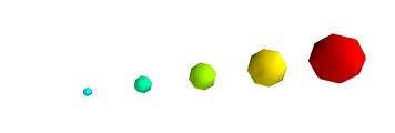
A caveat: Clamping: relative or absolute scaling Given six points positioned on a line with interpoint spacing 1:
x = [1, 2, 3, 4, 5, 6]
y = [0, 0, 0, 0, 0, 0]
z = y
如果我们将数据的标量范围设定为0.5到1:
s = [.5, .6, .7, .8, .9, 1]
使用`points3d`方法,我们将数据集可视化成球状,标量数据会和数据集进行一一匹配。
from mayavi import mlab
pts = mlab.points3d(x, y, z, s)
默认情况下,小球的直径不是严格的。事实上,标量最小的值它的直径是空值null,最大的值所对应的球,其直径正比于点与点之间的距离。这个比例是相对的,如下面的结果:
This behavior gives visible points for all datasets, but may not be desired if the scalar represents the size of the glyphs in the same unit as the positions specified.
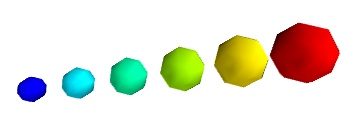
这时候您可以通过指定scale_factor控制放缩系数,从而关闭auto-scaling自动放缩。
pts = mlab.points3d(x, y, z, s, scale_factor=1)
警告
在Mayavi的早期版本(包括3.1.0之前),图形的放缩并不是自动的。由于可视化的图形尺寸偏小,导致可视化看起来很空旷。而数据中的最小值其图形直径是严格为0的,除非您指定,其导致图形无法放缩。
pts.glyph.glyph.clamping = False
- 标量和矢量可视化的更多表现:
There are many more ways to represent the scalar or vector information attached to the data. For instance, scalar data can be ‘warped’ into a displacement, e.g. using a WarpScalar filter, or the norm of scalar data can be extracted to a scalar component that can be visualized using iso-surfaces with the ExtractVectorNorm filter.
- Displaying more than one quantity:
You may want to display color related to one scalar quantity while using a second for the iso-contours, or the elevation. This is possible but requires a bit of work: see Atomic orbital example.
If you simply want to display points with a size given by one quantity, and a color by a second, you can use a simple trick: add the size information using the norm of vectors, add the color information using scalars, create a
quiver3d()plot choosing the glyphs to symmetric glyphs, and use scalars to represent the color:x, y, z, s, c = np.random.random((5, 10)) pts = mlab.quiver3d(x, y, z, s, s, s, scalars=c, mode='sphere') pts.glyph.color_mode = 'color_by_scalar' # Finally, center the glyphs on the data point pts.glyph.glyph_source.glyph_source.center = [0, 0, 0]
Changing the scale and position of objects
Each mlab function takes an extent keyword argument, that allows to set its (x, y, z) extents. This give both control on the scaling in the different directions and the displacement of the center. Beware that when you are using this functionality, it can be useful to pass the same extents to other modules visualizing the same data. If you don’t, they will not share the same displacement and scale.
The surf(), contour_surf(), and barchart() functions, which
display 2D arrays by converting the values in height, also take a
warp_scale parameter, to control the vertical scaling.
Changing object properties interactively
Mayavi, and thus mlab, allows you to interactively modify your visualization.
The Mayavi pipeline tree can be displayed by clicking on the mayavi icon
in the figure’s toolbar, or by using show_pipeline() mlab command.
One can now change the visualization using this dialog by double-clicking
on each object to edit its properties, as described in other parts of
this manual, or add new modules or filters by using this icons on the
pipeline, or through the right-click menus on the objects in the
pipeline.
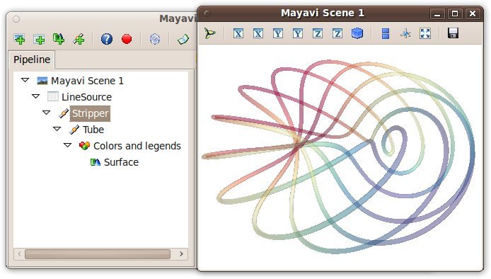
除此之外,每一个生成的对象都会有返回值,它将返回mlab函数。``this_object.edit_traits()``将启动一个对话框,您可以用交互的方式对对象的属性进行编辑。如果您没能成功开启对话框,请参考`running-mlab-scripts`。
图像,图例,相机设置及图像修饰
对多个图像进行处理
所有的mlab函数仅对当前的scene层级有效,这与matlab和pyplot是一样的,因此我们使用figure函数进行不同scene之间的切换。如果我们要切换不同的图像,可以使用键值对进行索引,键接受整形integer和字符串string的类型。使用figure函数匹配其键值对,它会返回相应的图像;如果键对应的scene层级不存在,它会创建一个。 使用gcf函数恢复当前绘制的图像; 使用draw函数对图像进行更新; 使用savefig函数保存当前的图像。
图像修饰函数
使用axes函数可以为可视化对象添加坐标轴。 使用xlabel,ylabel,zxlabel函数可以为图像添加坐标轴标签。 相似的用法,outline函数可以为可视化图像创建外框。 title函数可以为图像添加标题。
Color bar颜色条或比色卡是其数据的映射(其配色方案在LUT中设定),默认情况下`colorbar`函数创建的是最后一个数据的映射,如果数据是标量则创建为标量比色卡,矢量也是如此。也可以指定scalarbar和vectorbar创建相应的比色卡。
也可以使用orientation_axes同时添加三个坐标轴的标签。
警告
在版本3.2之前,orientation_axes函数为orientationaxes
Moving the camera
The position and direction of the camera can be set using the view()
function. They are described in terms of Euler angles and distance to a
focal point. The view() function tries to guess the right roll angle
of the camera for a pleasing view, but it sometimes fails. The roll()
explicitly sets the roll angle of the camera (this can be achieve
interactively in the scene by pressing down the control key, while
dragging the mouse, see 使用scene层级交互).
The view() and roll() functions return the current values of
the different angles and distances they take as arguments. As a result, the
view point obtained interactively can be stored and reset using:
# Store the information
view = mlab.view()
roll = mlab.roll()

# Reposition the camera
mlab.view(*view)
mlab.roll(roll)
备注
Camera parallel scale
In addition to the information returned and set by mlab.view and mlab.roll, a last parameter is needed to fully define the view point: the parallel scale of the camera, that control its view angle. It can be read (or set) with the following code:
f = mlab.gcf()
camera = f.scene.camera
cam.parallel_scale = 9
运行mlab脚本
Mlab和Mayavi的其他部分一样,是一个交互性的应用。如果当前不是集成环境(见下一节),您需要使用show函数开启交互。假设您在编写脚本,您每次都需要调用show显示图像。
使用mlab交互
使用IPython,mlab指令可以交互式进行,或者也可以使用IPython执行 %run command:
In [1]: %run my_script
您需要使用 –gui=qt 开启Qt界面选项。在这个环境下,绘图命令是可交互的:不用show函数也能呈现即时效果。
Mlab也能在Mayavi2应用中进行交互,确切来说,所有以wxPython为基础的Python脚本都可以进行(比如其他的Envisage基础的应用,如SPE)。
与Matplotlib一起使用
如果您想在IPython中使用同时使用Matplotlib和Mayavi进行交互,您应该:
打开IPython:
$ ipython --matplotlib=qt相应地,打开IPython的图像界面:–gui=qt
$ ipython --gui=qt在调用任何matplotlib的模块之前,需要先输入以下Python命令:
>>> import matplotlib
>>> matplotlib.use('Qt4Agg')
>>> matplotlib.interactive(True)
one could also use the
--pylaboption to IPython as follows:$ ipython --pylab=qt
如果您想要默认情况下让mlab和matplotlib在IPython一起工作,您可以修改matplotlib的后端配置:编辑`~/.matplotlib/matplotlibrc`配置文件,添加下面内容:
backend : Qt4Agg
如果因为某些原因,Qt后端无法正常使用,您可以使用wx后端。您可以这样做:
$ ETS_TOOLKIT=wx
$ ipython --gui=wx
Note that as far as Mayavi is concerned, it chooses the appropriate
toolkit using the ETS_TOOLKIT environment variable. If this is
not set, the supported toolkits are tried in a version-dependent order
until one succeeds. With recent releases of traitsui, the default is
Qt. The possible options for ETS_TOOLKIT are:
qt4: 使用Qt后端(PySide 或 PyQt4)
wx:使用wxPython
null:使用无界面的工具箱
脚本
Mlab绘图命令可以写入文件做成一个脚本。脚本的加载方式可以通过*File->Refresh code*菜单栏进入,也可以通过键盘``Control-r``的方式。当然也可以由Mayavi应用通过``-x``开启。
前面提到过集成环境,但当使用`python myscript.py`的命令运行在非集成环境时,需要调用show函数(这里有一个案例),它会开启交互并显示您的图像。
您也可以使用装饰器的方法,将被调用的mlab函数放在一个定义的函数体中会使其变得更加灵活,然后它将开启事件循环event-loop的交互界面:
from mayavi import mlab
from numpy import random

@mlab.show
def image():
   mlab.imshow(random.random((10, 10)))
在这个装饰器的作用下,每次调用绘图函数,mlab都会确保交互开启。如果交互没能启动,mlab会打开它直到关闭交互之前都不会直接返回其函数对象。
将数据做成动画
有时数据可视化并不能满足需求,我们希望能改变数据并更新它并重新可视化,比如动画。事实上,重新创建全部的可视化是非常低效的,而且会非常不稳定。为了解决这个问题,mlab提供了非常方便的方法,我们在这里给出一个非常简单的示例。 请参考:mlab.test_simple_surf_anim
import numpy as np
from mayavi import mlab
x, y = np.mgrid[0:3:1,0:3:1]
s = mlab.surf(x, y, np.asarray(x*0.1, 'd'))

for i in range(10):
    s.mlab_source.scalars = np.asarray(x*0.1*(i+1), 'd')
代码的前两行绘制了一个简单的平面。定义的函数体内部通过循环的方式,不断改变标量值使平面绕原点旋转。这里的关键之处在于传标量数据的`s`对象,它有一个特殊的属性`.mlab_source`,我们可以对它的子对象`.scalars`进行修改。如果我们相对坐标信息进行修改,我们同样可以这样做。
s.mlab_source.x = new_x
我们仅需记住,不应该改变x的数组维度
需要引起注意的是,这里所讨论的一些案例不一定是动画,仅仅是动画的最后一帧。如果将图像的每帧截图都保存下来,虽然您也将会得到相应的结果,但是您无法得到想要的效果。参考`animating_a_visualization`(mayavi.mlab.animate),学习`@animate`装饰器的用法来完成它。我们在这里展示一个简单的案例重写上面的动画。
import numpy as np
from mayavi import mlab
x, y = np.mgrid[0:3:1,0:3:1]
s = mlab.surf(x, y, np.asarray(x*0.1, 'd'))

@mlab.animate
def anim():
    for i in range(10):
        s.mlab_source.scalars = np.asarray(x*0.1*(i+1), 'd')
        yield

anim()
mlab.show()
如上面的案例,我们对生成器进行装饰,并将迭代封装在函数体中。
如果有多个值需要更新,您可以使用mlab的属性`mlab_source`,调用该属性的`set`方法,从而完成更加复杂的动画,案例如下:
# Produce some nice data.
n_mer, n_long = 6, 11
pi = np.pi
dphi = pi/1000.0
phi = np.arange(0.0, 2*pi + 0.5*dphi, dphi, 'd')
mu = phi*n_mer
x = np.cos(mu)*(1+np.cos(n_long*mu/n_mer)*0.5)
y = np.sin(mu)*(1+np.cos(n_long*mu/n_mer)*0.5)
z = np.sin(n_long*mu/n_mer)*0.5

# View it.
l = mlab.plot3d(x, y, z, np.sin(mu), tube_radius=0.025, colormap='Spectral')

# Now animate the data.
ms = l.mlab_source
for i in range(10):
    x = np.cos(mu)*(1+np.cos(n_long*mu/n_mer +
                                      np.pi*(i+1)/5.)*0.5)
    scalars = np.sin(mu + np.pi*(i+1)/5)
    ms.trait_set(x=x, scalars=scalars)
需要注意的是`set`方法使用的场合,使用该方法,渲染智慧重新计算一次。在这个案例中,数组的维度并没有发生变化,仅仅是其数值的更新。当数值的维度也发生变化的时候,我们需要用 `reset`方法,案例如下:
x, y = np.mgrid[0:3:1,0:3:1]
s = mlab.surf(x, y, np.asarray(x*0.1, 'd'),
              representation='wireframe')
# Animate the data.
fig = mlab.gcf()
ms = s.mlab_source
for i in range(5):
    x, y = np.mgrid[0:3:1.0/(i+2),0:3:1.0/(i+2)]
    sc = np.asarray(x*x*0.05*(i+1), 'd')
    ms.reset(x=x, y=y, scalars=sc)
    fig.scene.reset_zoom()
Mayavi提供了许多使用mlab动画的标准案例。您可以运行mlab.test_<name>_anim 说明:案例的名字都以anim结尾,这些例子用以说明是它们如何工作的。
备注
需要引起重视的是,set 和 reset 方法是有所差别的。当你没有改变数据的维度仅仅是对数值进行修改,使用 set 方法可以直接定义属性 (x, y, scalars 等)。但当数组的维度发生变化时候,则需要使用`reset`方法,它的行为通常是重新生成是所有的数据,相比`set`方法和设置特性而言,这种做法效率更低。
警告
如果不直接使用预制好的绘图函数,而是要配置Mayavi的pipeline管线,则`mlab_source` 属性只能先从sources数据源,经由mlab进行创建,更多细节将在子章节进行介绍。完全由mlab创建的管线,将提供这个属性。
备注
如果您有多个动画对象,每次您使用`mlab_source`属性进行修改,Mayavi都会对当前的scene层级弹出一个refresh用于更新的对话框。这个操作会耗费一定时间,会使您的动画变慢。下面这个案例能帮到您:acceleration_mayavi_scripts
使用mlab配置pipeline管线
前面使用的绘图函数仅仅是Mayavi的一小部分,它还有更大的空间和可能性。Mayavi的全部威力需要配合pipeline管线才能完全释放出来。关于使用`data source`对象加载数据进行可视化可以参考章节`an-overview-of-mayavi`。其中有一个数据变换的环节是可选的:它通过`filters`滤波层级和`module`可视化层级完成。而mlab函数仅通过1行代码就能完成复杂的管线配置,完成sources数据源层级,filters层级以及module层级的搭建。其弊端是分化过于完全无法做更多的延伸,以及探索可能的结合方式。
Mlab所包含的子模块`pipeline` 可以使脚本能轻松配置管线。这个模块可以使用 `mlab`调用:`mlab.pipeline,或者直接以 `mayavi.tools.pipeline`方式引入环境。
当我们使用`mlab`绘图函数的时候,管线已会自动完成搭建:首先是来自`numpy`数组的数据创建source数据源层级,然后是module可视化模块层级,在两者之间可能带有filter滤波层级。对于已经配置好的管线,我们可以使用 `mlab.show_pipeline`进行查看。利用它的层级配置信息,我们可以使用`pipeline`的配置方法对其进行复现。在这里我们需要各个层级的配置函数的信息,其所使用的函数名默认也是pipeline管线的函数名。下面我们演示一个案例,使用`surf`函数构建可视化: 译者注:这是两种绘图的方式,前者是直接使用高度预制好的surf绘图函数,后者使用pipeline按层搭建,旨在说明两者具有相同的效果。比如Array2DSource数据源层级的名称,也是pipeline的方法名pipeline.array2d_source。
import numpy as np
a = np.random.random((4, 4))
from mayavi import mlab
mlab.surf(a)
mlab.show_pipeline()
以下是所创建的管线:
Array2DSource
    \__ WarpScalar
            \__ PolyDataNormals
                    \__ Colors and legends
                            \__ Surface
相同的pipeline管线也可以用下面的代码进行搭建:
src = mlab.pipeline.array2d_source(a)
warp = mlab.pipeline.warp_scalar(src)
normals = mlab.pipeline.poly_data_normals(warp)
surf = mlab.pipeline.surface(normals)
Data sources数据源层级
The mlab.pipeline module contains functions for creating various data sources from arrays. They are fully documented in details in the Mlab 管线配置参考. We give a small summary of the possibilities here.
Mayavi将数据区分为**scalar data 标量数据**和**vector data 矢量数据**。有一点尤为重要,他们用不同的方法创建**unconnected points 离散点**,或具有连续变化的**connected data points 连续点** 。后者会在点与点时间采用插值,在物理和工程上是`fields 场`的概念。
- Unconnected sources:
scalar_scatter()(creates a PolyData)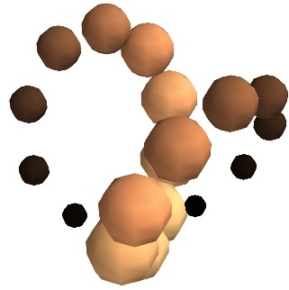
vector_scatter()(creates an PolyData)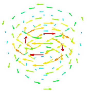
- implicitly-connected sources:
scalar_field()(creates an ImageData)
vector_field()(creates an ImageData)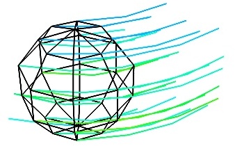
array2d_source()(creates an ImageData)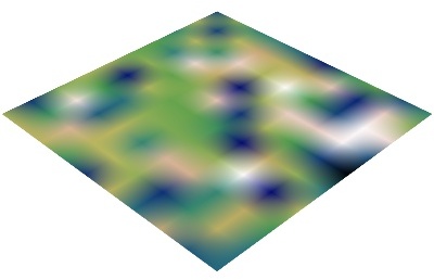
- Explicitly-connected sources:
line_source()(creates an PolyData)
triangular_mesh_source()(creates an PolyData)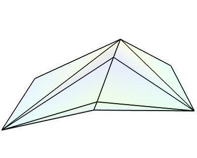
All the mlab.pipline source factories are functions that take numpy arrays and return the Mayavi source object that was added to the pipeline. However, the implicitly-connected sources require well-shaped arrays as arguments: the data is supposed to lie on a regular, orthogonal, grid of the same shape as the shape of the input array, in other words, the array describes an image, possibly 3 dimensional.
备注
More complicated data structures can be created, such as irregular grids or non-orthogonal grid. See the section on data structures.
Modules and filters
For each Mayavi module or filter (see Module 可视化模块 and Filters), there is a corresponding mlab.pipeline function. The name of this function is created by replacing the alternating capitals in the module or filter name by underscores. Thus ScalarCutPlane corresponds to scalar_cut_plane.
In general, the mlab.pipeline module and filter factory functions simply create and connect the corresponding object. However they can also contain addition logic, exposed as keyword arguments. For instance they allow to set up easily a colormap, or to specify the color of the module, when relevant. In accordance with the goal of the mlab interface to make frequent operations simple, they use the keyword arguments to choose the properties of the created object to suit the requirements. It can be thus easier to use the keyword arguments, when available, than to set the attributes of the objects created. For more information, please check out the docstrings. Full, detailed, usage examples are given in the next subsection.
Case studies of some visualizations
Visualizing volumetric scalar data
There are three main ways of visualizing a 3D scalar field. Given the following field:
import numpy as np
x, y, z = np.ogrid[-10:10:20j, -10:10:20j, -10:10:20j]
s = np.sin(x*y*z)/(x*y*z)
- Iso-Surfaces:
To display iso surfaces of the field, the simplest solution is simply to use the
mlabcontour3d()function:mlab.contour3d(s)
The problem with this method is that the outer iso-surfaces tend to hide inner ones. As a result, quite often only one iso-surface can be visible.
- Volume rendering:
Volume rendering is an advanced technique in which each voxel is given a partly transparent color. This can be achieved with mlab.pipeline using the
scalar_field()source, and the volume module:mlab.pipeline.volume(mlab.pipeline.scalar_field(s))
For such a visualization, tweaking the opacity transfer function is critical to achieve a good effect. Typically, it can be useful to limit the lower and upper values to the 20 and 80 percentiles of the data, in order to have a reasonable fraction of the volume transparent:
mlab.pipeline.volume(mlab.pipeline.scalar_field(s), vmin=0, vmax=0.8)
It is useful to open the module’s dialog (eg through the pipeline interface, or using it’s edit_traits() method) and tweak the color transfer function to render the transparent low-intensity regions of the image. For this module, the LUT as defined in the Colors and legends node are not used.
The limitations of volume rendering is that, while it is often very pretty, it can be difficult to analyze the details of the field with it.
- Cut planes:
While less impressive, cut planes are a very informative way of visualizing the details of a scalar field:
mlab.pipeline.image_plane_widget(mlab.pipeline.scalar_field(s),
                            plane_orientation='x_axes',
                            slice_index=10,
                        )
mlab.pipeline.image_plane_widget(mlab.pipeline.scalar_field(s),
                            plane_orientation='y_axes',
                            slice_index=10,
                        )
mlab.outline()
Image plane widgets can also being created from NumPy arrays using the
mlabvolume_slice()function:mlab.volume_slice(s, plane_orientation='x_axes', slice_index=10)
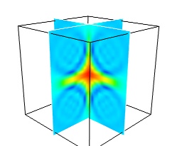
The image plane widget can only be used on regular-spaced data, as created by mlab.pipeline.scalar_field, but it is very fast. It should thus be prefered to the scalar cut plane, when possible.
Clicking and dragging the cut plane is an excellent way of exploring the field.
- A combination of techniques:
Finally, it can be interesting to combine cut planes with iso-surfaces and thresholding to give a view of the peak areas using the iso-surfaces, visualize the details of the field with the cut plane, and the global mass with a large iso-surface:
src = mlab.pipeline.scalar_field(s)
mlab.pipeline.iso_surface(src, contours=[s.min()+0.1*s.ptp(), ], opacity=0.1)
mlab.pipeline.iso_surface(src, contours=[s.max()-0.1*s.ptp(), ],)
mlab.pipeline.image_plane_widget(src,
                            plane_orientation='z_axes',
                            slice_index=10,
                        )
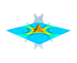
In the above example, we have used the pipeline syntax of mayavi instead of using
contour3d()andvolume_slice()in order to use a single scalar field as data source.In some cases, though not in our example, it might be usable to insert a threshold filter before the cut plane, eg:to remove area with values below ‘s.min()+0.1*s.ptp()’. In this case, the cut plane needs to be implemented with mlab.pipeline.scalar_cut_plane as the data looses its structure after thresholding.
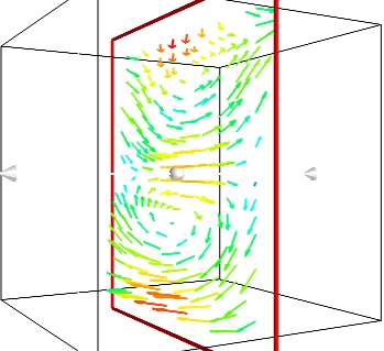
Visualizing a vector field
A vector field, i.e., vectors continuously defined in a volume, can be difficult to visualize, as it contains a lot of information. Let us explore different visualizations for the velocity field of a multi-axis convection cell [1], in hydrodynamics, as defined by its components sampled on a grid, u, v, w:
import numpy as np
x, y, z = np.mgrid[0:1:20j, 0:1:20j, 0:1:20j]

u =    np.sin(np.pi*x) * np.cos(np.pi*z)
v = -2*np.sin(np.pi*y) * np.cos(2*np.pi*z)
w = np.cos(np.pi*x)*np.sin(np.pi*z) + np.cos(np.pi*y)*np.sin(2*np.pi*z)
- Quiver:
The simplest visualization of a set of vectors, is using the mlab function quiver3d:
mlab.quiver3d(u, v, w)
mlab.outline()
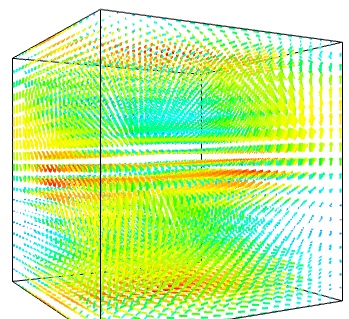
The main limitation of this visualization is that it positions an arrow for each sampling point on the grid. As a result the visualization is very busy.
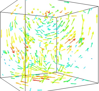
- Masking vectors:
We can use the fact that we are visualizing a vector field, and not just a bunch of vectors, to reduce the amount of arrows displayed. For this we need to build a vector_field source, and apply to it the vectors module, with some masking parameters (here we keep only one point out of 20):
src = mlab.pipeline.vector_field(u, v, w)
mlab.pipeline.vectors(src, mask_points=20, scale_factor=3.)
- A cut plane:
If we are interested in displaying the vectors along a cut, we can use a cut plane. In particular, we can inspect interactively the vector field by moving the cut plane along: clicking on it and dragging it can give a very clear understanding of the vector field:
mlab.pipeline.vector_cut_plane(src, mask_points=2, scale_factor=3)
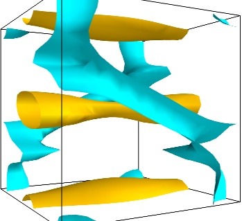
- Iso-Surfaces of the magnitude:
An important parameter of the vector field is its magnitude. It can be interesting to display iso-surfaces of the normal of the vectors. For this we can create a scalar field from the vector field using the ExtractVectorNorm filter, and use the Iso-Surface module on it. When working interactively, a good understanding of the magnitude of the field can be gained by changing the values of the contours in the object’s property dialog.
magnitude = mlab.pipeline.extract_vector_norm(src)
mlab.pipeline.iso_surface(magnitude, contours=[1.9, 0.5])
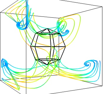
- The Flow, or the field lines:
For certain vector fields, the line of flow along the field can have an interesting meaning. For instance this can be interpreted as a trajectory in hydrodynamics, or field lines in electro-magnetism. We can display the flow lines originating for a certain seed surface using the streamline module, or the mlab
flow()function, which relies on streamline internally:flow = mlab.flow(u, v, w, seed_scale=1, seed_resolution=5, integration_direction='both')
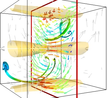
- A combination of techniques:
Giving a meaningful visualization of a vector field is a hard task, and one must use all the tools at hand to illustrate his purposes. It is important to choose the message conveyed. No one visualization will tell all about a vector field. Here is an example of a visualization made by combining the different tools above:
mlab.figure(fgcolor=(0., 0., 0.), bgcolor=(1, 1, 1))
src = mlab.pipeline.vector_field(u, v, w)
magnitude = mlab.pipeline.extract_vector_norm(src)

# We apply the following modules on the magnitude object, in order to
# be able to display the norm of the vectors, eg as the color.
iso = mlab.pipeline.iso_surface(magnitude, contours=[1.9, ], opacity=0.3)

vec = mlab.pipeline.vectors(magnitude, mask_points=40,
                                    line_width=1,
                                    color=(.8, .8, .8),
                                    scale_factor=4.)

flow = mlab.pipeline.streamline(magnitude, seedtype='plane',
                                        seed_visible=False,
                                        seed_scale=0.5,
                                        seed_resolution=1,
                                        linetype='ribbon',)

vcp = mlab.pipeline.vector_cut_plane(magnitude, mask_points=2,
                                        scale_factor=4,
                                        colormap='jet',
                                        plane_orientation='x_axes')
备注
Although most of this section has been centered on snippets of code to create visualization objects, it is important to remember that Mayavi is an interactive program, and that the properties of these objects can be modified interactively, as described in Changing object properties interactively. It is often impossible to choose the best parameters for a visualization before hand. Colors, contour values, colormap, view angle, etc… should be chosen interactively. If reproducibiles are required, the chosen values can be added in the original script.
Moreover, the mlab functions expose only a small fraction of the possibilities of the visualization objects. The dialogs expose more of these functionalities, that are entirely controlled by the attributes of the objects returned by the mlab functions. These objects are very rich, as they are built from VTK objects. It can be hard to find the right attribute to modify when exploring them, or in the VTK documentation, thus the easiest way is to modify them interactively using the pipeline view dialog and use the record feature to find out the corresponding lines of code. See Organisation of Mayavi visualizations: the pipeline to understand better the link between the lines of code generated by the record feature and mlab. .