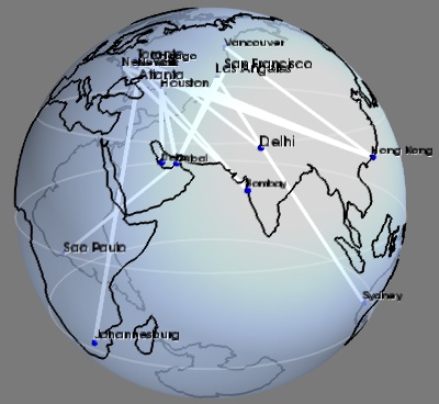
Flight graph example
An example showing a graph display between cities positioned on the Earth surface.
This graph displays the longest flight routes operated by Boing 777. The two main interests of this example are that it shows how to build a graph of arbitrary connectivity, and that it shows how to position data on the surface of the Earth.
The graph is created by first building a scalar scatter dataset with the mlab.points3d command, and adding line information to it. One of the difficulties is that the lines are specified using the indexing number of the points, so we must ‘massage’ our data when loading it. A similar technique to plot the graph is done in the Protein example. Another example of graph plotting, showing a different technique to plot the graph, can be seen on Delaunay graph example.
To simplify things we do not plot the connection on the surface of the Earth, but as straight lines going through the Earth. As a result must use transparency to show the connection.
Data source: http://www.777fleetpage.com/777fleetpage3.htm
Python source code: flight_graph.py
###############################################################################
# The data. This could be loaded from a file, or scraped from a website

routes_data = """
Bombay,Atlanta
Johannesburg,Atlanta
Dubai,Los Angeles
Dubai,Houston
Dubai,San Francisco
New York,Hong Kong
Newark,Hong Kong
Doha,Houston
Toronto,Hong Kong
Bombay,Newark
Bombay,New York
Vancouver,Hong Kong
Dubai,Sao Paulo
Los Angeles,Sydney
Chicago,Delhi
"""

cities_data = """
Toronto,-79.38,43.65
Chicago,-87.68,41.84
Houston,-95.39,29.77
New York,-73.94,40.67
Vancouver,-123.13,49.28
Los Angeles,-118.41,34.11
San Francisco,-122.45,37.77
Atlanta,-84.42,33.76
Dubai,55.33,25.27
Sydney,151.21,-33.87
Hong Kong,114.19,22.38
Bombay,72.82,18.96
Delhi,77.21,28.67
Newark,-82.43,40.04
Johannesburg,28.04,-26.19
Doha,51.53,25.29
Sao Paulo,-46.63,-23.53
"""

###############################################################################
# Load the data, and put it in data structures we can use
import csv
routes_table = [i for i in csv.reader(routes_data.split('\n')[1:-1])]

# Build a dictionnary returning GPS coordinates for each city
cities_coord = dict()
for line in list(csv.reader(cities_data.split('\n')))[1:-1]:
    name, long_, lat = line
    cities_coord[name] = (float(long_), float(lat))

# Store all the coordinates of connected cities in a list also keep
# track of which city corresponds to a given index in the list. The
# connectivity information is specified as connecting the i-th point
# with the j-th.
cities = dict()
coords = list()
connections = list()
for city1, city2 in routes_table[1:-1]:
    if not city1 in cities:
        cities[city1] = len(coords)
        coords.append(cities_coord[city1])
    if not city2 in cities:
        cities[city2] = len(coords)
        coords.append(cities_coord[city2])
    connections.append((cities[city1], cities[city2]))


###############################################################################
from mayavi import mlab
mlab.figure(1, bgcolor=(0.48, 0.48, 0.48), fgcolor=(0, 0, 0),
               size=(400, 400))
mlab.clf()

###############################################################################
# Display points at city positions
import numpy as np
coords = np.array(coords)
# First we have to convert latitude/longitude information to 3D
# positioning.
lat, long = coords.T * np.pi / 180
x = np.cos(long) * np.cos(lat)
y = np.cos(long) * np.sin(lat)
z = np.sin(long)

points = mlab.points3d(x, y, z,
                     scale_mode='none',
                     scale_factor=0.03,
                     color=(0, 0, 1))

###############################################################################
# Display connections between cities
connections = np.array(connections)
# We add lines between the points that we have previously created by
# directly modifying the VTK dataset.
points.mlab_source.dataset.lines = connections
points.mlab_source.reset()
# To represent the lines, we use the surface module. Using a wireframe
# representation allows to control the line-width.
mlab.pipeline.surface(points, color=(1, 1, 1),
                              representation='wireframe',
                              line_width=4,
                              name='Connections')

###############################################################################
# Display city names
for city, index in cities.items():
    label = mlab.text(x[index], y[index], city, z=z[index],
                      width=0.016 * len(city), name=city)
    label.property.shadow = True

###############################################################################
# Display continents outline, using the VTK Builtin surface 'Earth'
from mayavi.sources.builtin_surface import BuiltinSurface
continents_src = BuiltinSurface(source='earth', name='Continents')
# The on_ratio of the Earth source controls the level of detail of the
# continents outline.
continents_src.data_source.on_ratio = 2
continents = mlab.pipeline.surface(continents_src, color=(0, 0, 0))

###############################################################################
# Display a semi-transparent sphere, for the surface of the Earth

# We use a sphere Glyph, through the points3d mlab function, rather than
# building the mesh ourselves, because it gives a better transparent
# rendering.
sphere = mlab.points3d(0, 0, 0, scale_mode='none',
                                scale_factor=2,
                                color=(0.67, 0.77, 0.93),
                                resolution=50,
                                opacity=0.7,
                                name='Earth')

# These parameters, as well as the color, where tweaked through the GUI,
# with the record mode to produce lines of code usable in a script.
sphere.actor.property.specular = 0.45
sphere.actor.property.specular_power = 5
# Backface culling is necessary for more a beautiful transparent
# rendering.
sphere.actor.property.backface_culling = True

###############################################################################
# Plot the equator and the tropiques
theta = np.linspace(0, 2 * np.pi, 100)
for angle in (- np.pi / 6, 0, np.pi / 6):
    x = np.cos(theta) * np.cos(angle)
    y = np.sin(theta) * np.cos(angle)
    z = np.ones_like(theta) * np.sin(angle)

    mlab.plot3d(x, y, z, color=(1, 1, 1),
                        opacity=0.2, tube_radius=None)

mlab.view(63.4, 73.8, 4, [-0.05, 0, 0])
mlab.show()